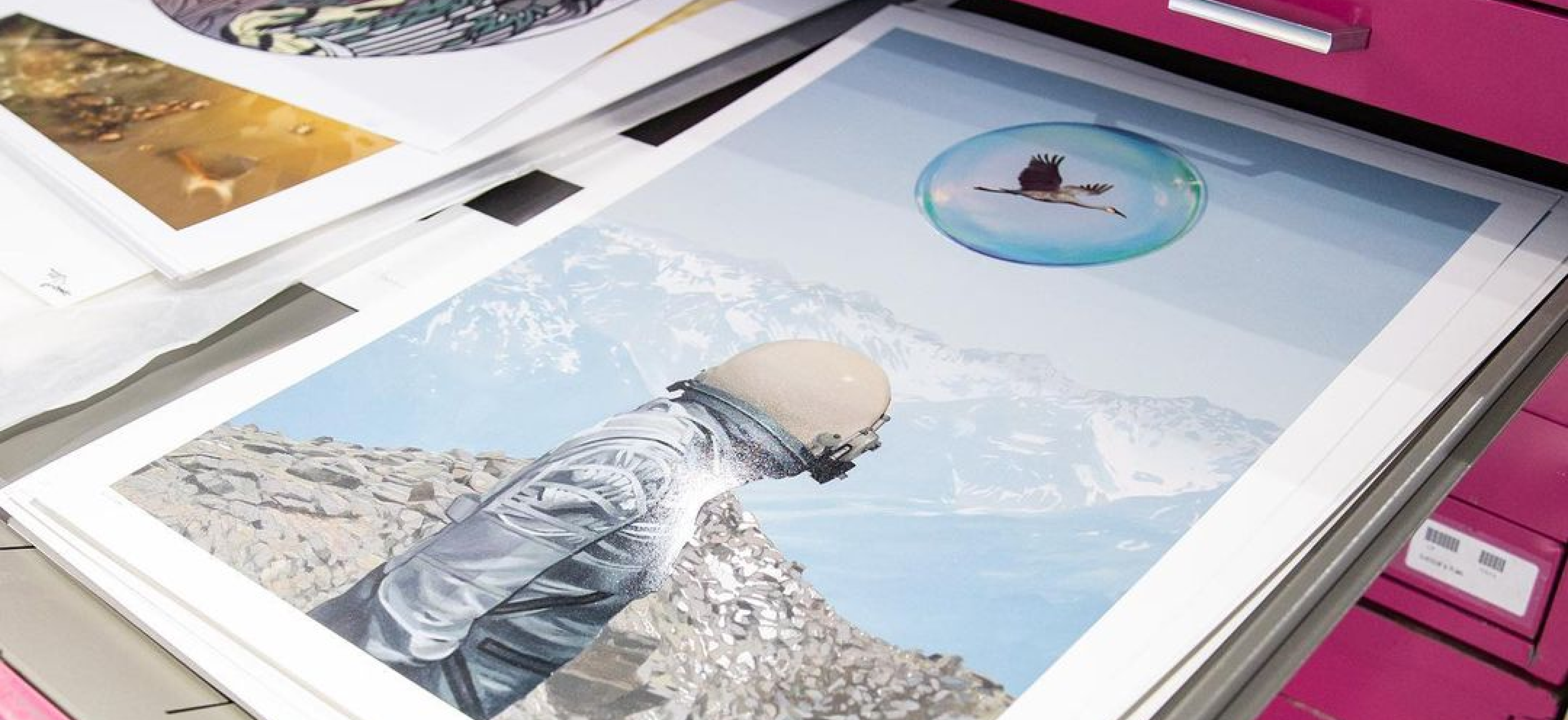
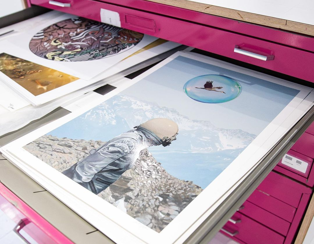
 Photo by WERC
Pantone threw a curveball this year, announcing that 2016 will not have one, but two colors of the year. A first in Pantone history, the company revealed that 2016 will be all about Rose Quartz and Serenity (think baby blue and baby pink). While each color leads to immediate associations with a specific gender, the combination of colors aims to challenge conventional stereotypes and establish a more fluid approach to color usage and gender identity.
The soft colors are also intended to have a calming effect on consumers amidst the constant stress of modern day life. “Joined together, Rose Quartz and Serenity demonstrate an inherent balance between a warmer embracing rose tone and the cooler tranquil blue, reflecting connection and wellness as well as a soothing sense of order and peace” (www.pantone.com).
To promote the colors, Pantone worked with creative agency Crewest Studio to organize the creation of three murals across the United States. Each with a unique approach and style, the three murals highlight the symbolic combination of rose quartz and serenity

Mural by Man One in Venice Beach, California (photo by Pantone)
Artist Man One created the first of the series in Venice Beach, California. While the concept for Man One’s mural is consistent with his graffiti background, the pastel colors are uncharacteristic for the artist. The outcome creates an interesting juxtaposition between the aggressive style and gentle color palette.

Mural by Victor Quinonez in Miami, Florida (photo by Pantone)
In Miami, Victor Quinonez painted a mural inspired by rose quartz and serenity. Quinonez’ mural is the only one of the three to not exclusively showcase rose quartz and serenity. However, they are key colors in his mural and demonstrate that the colors can be naturally and beautifully used alongside each other in art, fashion, design.

Mural by WERC in New York City (photo by WERC)
Finishing of the series was WERC, who created an incredible surreal mural in Hell’s Kitchen, New York City.
While the colors have a presence in urban art, the combination is also appearing across fashion, fine art, design, and home décor. Below, we highlight some of our favorite examples of the 2016 colors of the year.

Freedom to Roam by Whatisadam
 Photo by House of Turquoise
 Photo by Fashion Inspo
 Untitled V by Jason Botkin & Jeremy Shantz
Photo by Kitchen Studio of Naples Inc.
 Photo by Renewed Style
 Photo by House of Turquoise
 Photo by The White Pepper
 Star Wars GQ by Stikki Peaches
 Photo by French by Design
 Photo by By Signe
 Photo by Gosto Distro


